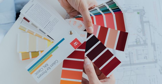
The possibilities of Internet technology facilitate the work process for many workers, including those working in the creative sphere. Designers, artists, and photographers can easily select a color scheme to implement their ideas thanks to color chart with names. Online palettes not only allow choosing a great color scheme for an interior design, a website or a company logo, but also help to harmonize colors for different purposes and emotions.
Why are colors important to the success of a project?
Each color has its own unique meaning and influence on a person’s emotional state. There is a whole science – color psychology – that explores how different colors and shades can affect mood and mental states. This science is important not only for psychologists who work with their clients, but also for marketers and designers who develop a visual strategy for a brand. For example, bright colors such as red or orange can increase energy levels and attract attention. These colors can encourage impulse buying, which is why online retailers often use them. If your brand does not have the goal of selling a product, but you are providing some kind of educational, medical or psychological services, then the best colors for your website may be blue or purple. They soothe the psyche and at the same time focus attention on the material. Thus, the productivity of learning or the level of focus of the consultation increases.
Visit here to know about best branding companies in the world.
How does a designer properly combine colors?
Designing the visual style of a website, online store or business page in a social network requires attention to detail. The most important element of this strategy is the color scheme, which should look harmonious and match the style of the entire brand. Usually, designers use one color scheme to maintain a visual balance:
- Monochromatic color scheme: its peculiarity is that the entire hue range revolves around a single color. The balance of colors is preserved by the absence of sharp contrasts, and the different intensities and tones of one color make the overall picture harmonious and attractive.
- Analog color scheme: Its content differs from the previous scheme, because here different colors placed side by side on the color wheel are combined. Thus, a smooth transition from one shade to another is preserved, and the brightness attracts the attention of website readers or customers of the online store.
- Triad color scheme: its principle is to choose three colors from a circle, which are located across from each other. Sometimes this scheme is called a triangle because of the formation of this geometric figure during the connection of colors with lines.
- Tetradic color scheme is formed on a similar principle as the previous one, but four colors are chosen from the circle across from each other. In order that the background image or the visual filling of a website to look harmoniously, from these four colors it is necessary to choose one dominating, and the other three should supplement the main color.
This list of color schemes is not complete, because designers can find dozens of options for combining hues and colors to achieve a particular result. Through the use of color charts with names and free palettes on the Internet you can not only harmoniously combine different colors, but also use this knowledge for professional purposes to evoke the right emotions.