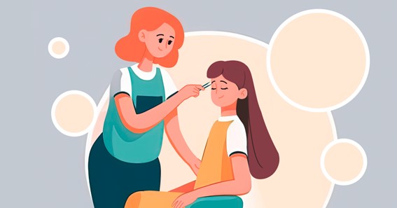
The concept of a beauty salon brand includes various components of the image, united by a single task: they form complex associations caused by the brand among potential and actual customers. One of these elements will be the logo of a beauty salon. The tips presented in our article, as well as the online Turbologo generator, will help you create it.
Why do you need a logo for a beauty salon?
A logo for a beauty salon is developed at the stage of creating a business concept. As a unique symbol, the logo (logo – from the Greek “word”, “speech”) corresponds to the corporate identity and complements it, works to develop the brand as a recognizable trademark and evokes clear associations with your beauty studio in the client.
The graphic sign acts as a beacon in the “friend or foe” communication, that is, it gives the potential client the opportunity to correlate the aesthetic and basic values of the company providing services with their own value system. Plus, the logo serves the same purpose for a hairdresser considering a job on your team.
After the launch of the project, the logo of the salon will appear on business cards, in the context of visual advertising (in printed publications, on leaflets, banners, videos, online service search services) and attract the attention of passers-by on the sign.
Marketers recommend bringing the logo of a hairdressing salon or multifunctional beauty salon in line with the following requirements:
- The logo of a beauty salon should be memorable, unbanal, simple;
- The logo should reflect the activities of the salon or be associated with it;
- The logo should be different from the brand symbols of competitors, serve to identify your brand.
Promotion sites may have their own requirements for logos in the beauty industry: a ban on the integration of advertising statements into the logo, legally prohibited goods and services (gambling, alcohol, etc.), photos. In some cities, a program is underway to unify street signs, which also imposes certain restrictions on the design of the version of the logo that will be placed at the entrance to the institution. All this should be taken into account.
Principles of creating a logo for a beauty studio
In marketing, the process of developing a logo for a beauty salon and any company in the field of beauty is based on the following principles:
-
Associativity
Let the graphics itself indicate the focus of your salon services. A good example: the image at the base of the logo of hairdressing scissors with detailed details (finger rest, limiters).
-
Reproducibility
A simple logo with a custom font is easy to draw and reproduce, and the risk of design errors is reduced to zero. A good example is the L’Oréal Professionnel logo, which can be seen in many beauty salons. The logo is textual, recognizable, respectable and uncomplicated.
-
Readability
A logo for a beauty salon can be beautiful and unique, memorable and creative, as long as the readability of the sign does not suffer. A good example is BLK, the logo of the Moscow beauty salon Belka in a minimalist style.
Within the framework of these principles, you can define and use the main features of a graphic logo: its appearance, color scheme, font and symbols.
Color scheme
Each color evokes certain associations, and some shades are especially appropriate on the logo of a beauty salon:
Delicate green. Associated with nature. Suitable for salons that have focused on the environmental friendliness of the used hair cosmetics;- Lilac. Associated with the sacrament of transformation and creativity. Shades of lilac can fit into sophisticated logos for luxury beauty salons;
- Sea blue. A touch of calm confidence and purity. Reminds visitors that they adhere to the highest, almost medical standards of sanitation and hygiene;
- Neon. Green, orange, yellow, purple and blue, luminous and bold, open up a zone of limitless creativity;
Black. Stylish and minimalistic, it is associated with high quality services and status. The best choice for business-class beauty salons, establishments with an accentuated brutal image that attract guests of both sexes, as well as for men’s barbershops of any price category.- White. Another color associated with purity and impeccability of appearance. Not used on its own, complements the logo as a background or image fill on a darker background;
- Pink. It rhymes with “feminine” interiors in neoclassical style, evokes pleasant associations with the anticipation of a date. Bright and flashy shades of the palette may be perceived by your target audience as vulgar. Pay attention to the calm dusty rose, peach pink, purplish pink and mauve pink.
Symbols
A symbol, or sign, in the beauty industry rarely becomes an independent logo, more often it is about its complementary role. Consider several possible uses for this type of graphics:
- Thematic signs. For beauty salon – scissors, comb, hair dryer, beard or female hairstyle pictogram. Unmistakably indicate the services provided by the institution;
- Talismans. When a particular animal appears in the name of the salon, even if it is an accident, it makes sense to include a schematic representation of this animal in the logo;
- Abbreviation. The first letter (or letters) of the name of the salon is graphically played up in the logo;
- Decor. Geometric shapes, floral patterns, vignettes, colored backgrounds are acceptable.
How to create a beauty salon logo using Turbologo’s online designer
So, now you have an idea of how your beauty salon logo should look like. It’s time to create it! For this:
- Go to Turbologo‘s website;
- Enter the company name/slogan in the corresponding field;
- Choose your favorite logo option;
- Make changes to the design;
- Download the finished logo.
That’s all! We wish you good luck in promoting your brand!


